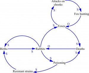
CLDs are designed to show the causal relationships between elements in a system. Understanding these relationships allows managers and policy makers to decide where to intervene to change the behaviour of the system.
A simple example, taken from Australia’s agrarian history, shows how CLDs work.
As the settlers wish to make Australia as much like mother England as possible, they introduced a range of fauna and flora, including rabbits.
This first CLD shows the basic dynamic of the rabbit population. The number of births is causally connected to the number of rabbits. As the number of births goes up the number of rabbits goes up. This is shown by an S at the end of the arrowhead showing that these two variables move in the Same direction. If births go up, rabbits go up. If births go down, the number of rabbits declines. Similarly, if deaths go up, the number of rabbits goes down. These two variables move in the Opposite direction, so there is an O at the end of the causal arrow.
Some people prefer to use + instead of an S and an – instead of an O. They are immediately interchangeable.
The next important element of the CLD is feedback. This is where one element of the system feeds back into another to influence the dynamics of the system.
Here is the dynamic relationship is between the rabbits and the births. (For simplicity’s sake, we are ignoring the issue of the birth rate but it is implicit in the model.)
Now the number of rabbit births is dependent on the rabbit population. Given the implicit birth rate, the growth of the population is exponential. This brings us to the second important element of CLDs: behaviour over time.
This graph shows the exponential growth of the rebel population.
As result of this population explosion, and the devastation that went with it, policymakers decided to intervene. In line with policy of making Australia like mother England, they decided to introduce foxes.
The idea behind this was that the foxes would increase the rate of rabbit deaths and this would decrease the number of rabbits. Notice that as the number of foxes goes up, rabbit deaths also go up (indicated by an S). As some result of the increase in rabbit deaths, the number of rabbits goes down (indicated by an O).
In many systems, policy decisions have Unintended Consequences. In this case, the increasing number of foxes, fed by a large rabbit population, again preying on the local chook populations. This led to a policy decision to introduce foxhunting, in the hope that that would lead to a decline in the fox population.
Unfortunately, the decline in the fox population led to a decline in the district of the rabbits and a consequent increase in the rabbit population, another unintended consequence of policy.
The final role of the policy dice was to introduce myxomatosis, a poison designed to control rabbit populations. At first, the population was immensely successful and the rabbit population declined rapidly. Unfortunately, a breed of super rabbits was able to resist the poison and this group of rabbits led to a rapid resurgence of the rabbit population.
The final behaviour over time graph of the policy interventions to control the population looks like this:
And the final behaviour over time graph is illustration of the way in which the dynamics and structure of the system can found policy options. In this case, policy had been directed at rabbit deaths. The COD indicates that another possible policy lever would be an intervention that focuses on rabbit births.


